UX
UX Audit: Status
The Dreaded Triple Bar – or when design is outside your control
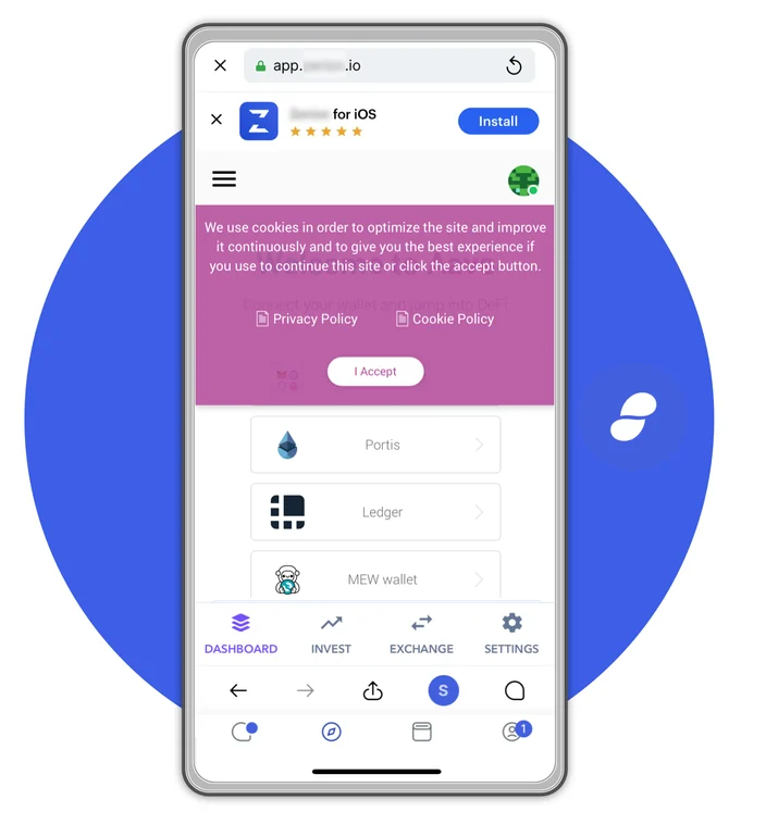
Status.im is one of the earliest projects on the space and the first to focus on a mobile browser. It starts with a–brilliantly correct–assumption that browsers in mobile are not about being smaller versions of their desktop companions but should be all about messaging. As a messaging app is also far ahead of the competition, being a rare example of an open-source, end to end encrypted, fully anonymous message app. I would say it’s one of the best-designed Ethereum focused wallets out there right now. Still, here’s how a typical Dapp looks in Status: Ok, this is an exaggeration, a composite of many nasty popups, tabs, and other anti-patterns I found while navigating. Here are two real-world…

UX Audit: Dark Forest Game
And in general more about how I approach the UX work While I’ve been an ethereum evangelist for the past 6 years (it feels so weird to type this!) I have never tried selling people on the idea of buying any coin., because while I am a believer (and hodler) of many assets, and an avid user of DEFI in general, I’ve been always more excited about other non-financial promises of blockchain general computing. Among them, blockchain games, to the extent I said this back when “games” in ethereum were either casinos or cryptokitties: What I want from blockchain games:1) be a good game first2) explore what makes blockchain unique3) design around the limitations4) persistent always on world 5)…
UX Audit: MetaMask Main Navigation
a UX audit about rethinking metamask menus
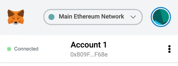
Making software—especially on the blockchain—that is both powerful and usable is very hard, I know. And sometimes we plan a lot of our UI but new features get added, some changes are done in the implementation and while we have ideas on how to improve that, they get pushed to our long backlog. So this isn’t intended as anything but praise at what the great work the team at MetaMask has been doing. I hope this analysis could be useful and due to the great utility MetaMask has on my life at the moment, I’d like to share it. So let’s talk about specifically this little bit on the app: Arguably, the most important piece of real estate of the app is the header and menu and it contains the…

Avoid Evil Twins: every ethereum app pays the price of a chain split
Parity has recently proposed an EIP to recover funds lost on the accidental destruction of a multisig library, which held hundreds of millions of dollars at current value by multiple teams. There are many debates rehashing the same arguments of the DAO hard fork, about immutability, precedent and moral hazards. I’d like to present a new side by talking what has changed between now and 2016 in the ethereum platform: a lot of new tokens and a new understanding about forks. If you build it, they will split it The first, most important is that forks are not only possible but can be profitable. Saying this now might be obvious, but there were many people who believed, back in 2016 that once a…
Aquatic Sugar: The Children's Interface, Translated for Adults
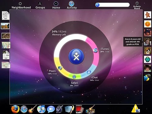
The field of interaction design has been shaken in the last year as it hasn't been since the Xerox Parc, more than 20 years ago. The old metaphors of desktops and the idea that the mouse is the center of our universe are being radically changed by mainly three mainstream products: the Wii, the iPhone and – of course, since you are reading OLPCNews – the XO laptop. You probably know about the Motion Sensors on the Nintendo video game, and about all the multiTouch going on with the apple phone, but do you know why the "$100 laptop" interface experience, called sugar, is radically different from any other operating system on the market? And why not? Because you don't like the icons. They don't…